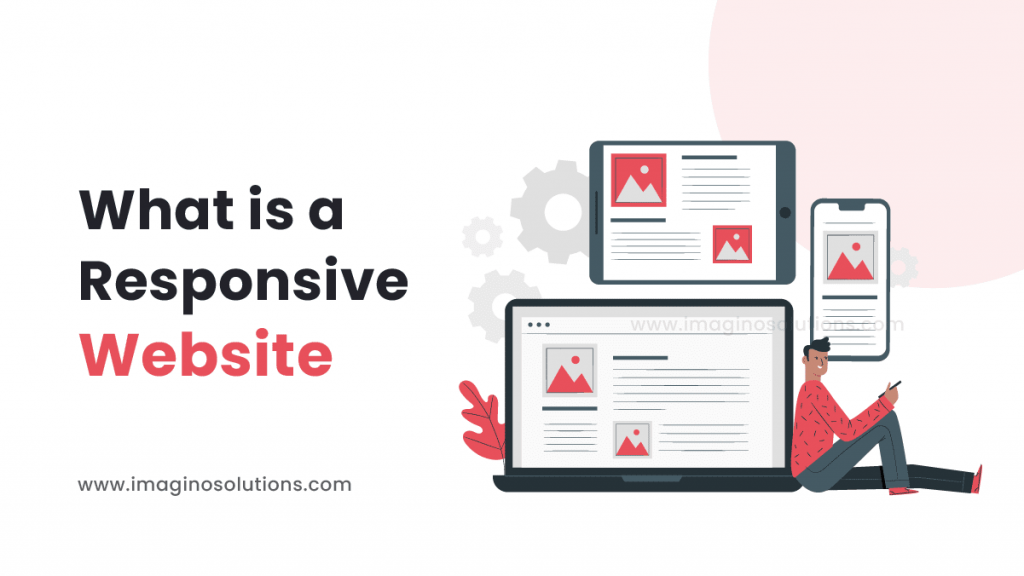
A responsive website is a website that is designed to automatically adjust its layout and content to look good on any device, whether it be a desktop computer, a tablet, or a smartphone. This is important because it allows users to have a consistent and user-friendly experience regardless of the device they are using to access the website.
Table of Contents
Responsive Website: Glance
In short, a responsive website is a website that adapts and reacts to user interaction. This is the most recommended and used website form that we have in existence now.
The idea of building responsive websites started when the number of internet consumable devices started increasing. Unlike earlier, we are not only looking into computers but various other devices too.
These devices have various resolutions and specifications and to match the rendered website in all these screen resolutions, it was quite a hassle that the web developers had to deal with.
Eventually, the solutions came into the picture and finally we could render the designed website in any screen size irrespective of the device, the website took various grid arrangements that helped the websites to fit automatically. They called it a “Responsive Website”.
Responsive Website: Insight
Today the best web design is not only judged by the way it looks on your pc or tv but also by how it looks on more portable small devices like cell phones and tablets. To achieve this, various frameworks like bootstrap were developed by developers so it becomes easy to develop a website daily.
According to various industrial research conducted globally, 60% of internet users consume the internet via mobile with 20 % being tablets and 20% being desktop consumers. The ratio sometimes is unbelievable but remains true.
Today, a mobile website is more of the developers’ focus than a full-fledged desktop website version since the ratio shows that the majority of consumers use mobile.
Take a practical example, whenever you want to google something or quickly look into some information where do you look? What is your first instinct? Your Smart Phone, yes that’s right.
A good website design will never restrict itself to a single render situation. The whole idea that “Not all Target Customers or Users will be having your monitor” will come into motion here.
The developers will have to develop a responsive website to rank at top of the search engine results as well. Now that may boggle one’s mind but if you think about it, the ranking in the search engines climbs based on how often a website is accessed and if the website is not optimized for all screen sizes then the chances of one reaching every other screen users limits there itself.
Responsive Website: Visuals
What about a design that incorporates text, objects, and tasteful colour use in addition to images? It’s been stated that a picture is worth a thousand words. The options are truly limitless. Only your imagination can restrain you.
Make sure your visual representation employs photos, atheistic designs, and an intuitive navigation menu to evoke the desired feelings. To communicate effectively, it must make use of images, fonts, and lyrical language.
Just like you would do interior design for an offline shop or landing site, you would do for the website. Imagine a convertible rack of items at your shop, imagine multipurpose furniture or items.
At the end of the day a shop is a shop or business place is still the same irrespective of whether they are hosted online or offline.
To have the same experience as in an offline store or even better use the technology to give that visual impact, it is important to “wow” the clients or visitors at the first glance itself.
This is where the responsive website, a good web design, comes in with an interactive design. The playing of a video as you scroll through, the 360-degree rotation of an object as you slide through carousels, all these rendered further to an adaptive web design is what forges into an impactful online business presence.
Responsive Website: Implementation
A responsive design works in conjunction with a responsive website framework to maximize its capability to present in the best way based on changing screen sizes.
To decide how a site will be laid up, Responsive Web Design uses so-called breakpoints. Above each breakpoint, one design is utilized, and below it, another design is used. The width of the browser is frequently used to determine the breakpoints.
As the viewport expands or contracts, page elements are rearranged according to responsive design. For a tablet and a smartphone, a three-column desktop layout might be changed to two columns and one column, respectively. Content and design elements are rearranged using proportion-based grids in responsive design.
By having the website act dynamically one could implement animated transformations to various elements and divs of the website while the user scrolls or clicks on an element. The dynamic motion in the website thus attracts the user more and makes him/her engage with the website more which increases the retention time again resulting in better search engine rankings.
Implementing responsive website design ensures the elimination of working for mobile website versions separately. The amount of effort is less in the long term and fixing an error on a single design would be sufficient to fix the bug in an overall website being adapted to all screen sizes.
Responsive Website: Outcome
Responsive websites use common standard algorithms like “bootstrap” to get a responsive design. Since the framework is widely used the cache data in the world wide web servers helps with the loading speed. This way a responsive website ever renders faster to give the user a seamless error-free experience.
Let’s be real! Google prioritizes the mobile web first. Since the usability of the web is more frequent through phones, the commercial aspects of the internet come into the picture more when the web is mobile friendly, so that remains one of the reasons why a mobile-friendly website or in this context responsive website is highlighted more.
The bounce rate is another demon, it’s a term used when someone triggers your website and leaves without interacting further. The percentage of visitors to your site who leave after one visit is displayed as your bounce rate. The term just came into existence from its verbal character. And to avoid that from happening, visual appeal is made hooking so nobody brushes through and dusts off.
Think about cost-effectiveness. When responsive websites are built with a ‘one-time effort’ you are parallelly creating websites for all screen sizes or target render devices. You do not have to spend more on developing different websites for different screen sizes. In the earlier era of the internet and multiple render devices, web designers had to struggle to develop websites separately for different devices serving the same client or business. The amount of team and human resources that went behind it and the resources that went behind fixing all the bugs in all the other parallel web designs were huge resulting in high investment and less number of websites online.
Responsive Website: Conclusion
Now, since responsive websites are in the picture, it is user friendly, affordable, seamless, bug-free, traffic-optimized and dynamic. The responsive grids and layouts arrange themselves to various landscapes and portrait renders.
With responsive web design implementation, Web designers, user interface designers, and web developers no longer have to spend all day and night building websites for every single device that exists thanks to responsive web design. Additionally, it simplifies the lives of entrepreneurs, marketers, and advertising executives. Feel free to contact, imaginosolutions to build your own responsive website.


